Get Started
What is Media Chrome?
Media Chrome provides fully customizable media player controls using web components.
Key Features
Section titled Key Features- Web Components: Compatible with any Javascript framework (React, Angular, Svelte, etc.)
- Unified API: Compatible with the
<video>and<audio>elements and a lot of other players - HTML first: Write plain HTML to add and remove controls
- Easy styling: Simple CSS to style the controls
Quick Demo
Section titled Quick DemoAdding controls to a video element
Section titled Adding controls to a video elementJust HTML. No javascripting required.
Install
Section titled Install<media-chrome> is only packaged as a javascript module (es6), which is supported by all evergreen browsers and Node v12+. The package includes all of the existing media controls.
Option 1: Hosted
Section titled Option 1: HostedLoad the module in the <head> of your HTML page. Note the type="module", that’s important.
Modules are always loaded asynchronously by the browser, so it’s ok to load them in the head 👍
<script type="module" src="https://cdn.jsdelivr.net/npm/media-chrome@0/+esm"></script>Option 2: Bundled via npm
Section titled Option 2: Bundled via npmnpm install media-chrome --saveimport 'media-chrome';Include in your app javascript (e.g. src/App.js)
This will register the custom elements with the browser so they can be used as HTML.
Using in your HTML
Section titled Using in your HTMLThe <media-controller> is the star of the show. It handles the communication between control elements and the media. Start by wrapping your media element with a <media-controller>, and adding slot="media" to your video or audio tag, or other compatible player.
<media-controller>
  <video
    slot="media"
    src="https://stream.mux.com/DS00Spx1CV902MCtPj5WknGlR102V5HFkDe/high.mp4"
  ></video>
</media-controller>
After that, each control element can be used independently. When using outside of a <media-controller> element, a control needs to be told which media controller it’s associated with via the media-controller attribute or property.
<media-controller id="myController">
  <video
    slot="media"
    src="https://stream.mux.com/DS00Spx1CV902MCtPj5WknGlR102V5HFkDe/high.mp4"
  ></video>
  <media-play-button></media-play-button>
</media-controller>

<media-play-button media-controller="myController"></media-play-button>
Customizing the controls
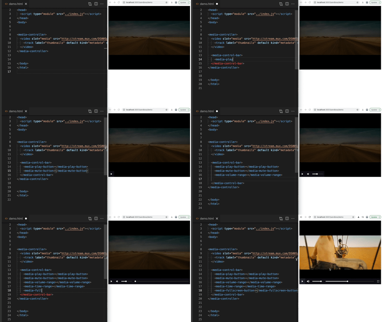
Section titled Customizing the controlsUse HTML to add or remove any of the controls. Then you can use CSS to style the controls as you would other HTML elements.
<media-controller>
  <video
    slot="media"
    src="https://stream.mux.com/DS00Spx1CV902MCtPj5WknGlR102V5HFkDe/high.mp4"
  ></video>
  <media-control-bar>
    <media-play-button></media-play-button>
    <media-mute-button></media-mute-button>
    <media-volume-range></media-volume-range>
    <media-time-range></media-time-range>
    <media-pip-button></media-pip-button>
    <media-fullscreen-button></media-fullscreen-button>
  </media-control-bar>
</media-controller>
Included elements
Section titled Included elements| Element | Description |
|---|---|
<media-controller> | Wraps controls and the media element, and handles communication between them. (docs) |
<media-control-bar> | Optional controls container to help align the controls in the standard fashion. |
<media-play-button> | Toggle media playback. (docs) |
<media-mute-button> | Toggle the sound. The icon responds to volume changes and acts as part of the typical volume control. (docs) |
<media-volume-range> | Change the volume of the sound. (docs) |
<media-time-range> | See how far the playhead is through the media duration, and seek to new times. (docs) |
<media-time-display> | Show the time of the playhead. Options: <media-time-display remaining> Show as remaining time <media-time-display show-duration> Also show the duration after a slash. Ex: 1:00 / 2:00. (docs) |
<media-duration-display> | Show the duration of the media |
<media-fullscreen-button> | Toggle fullscreen viewing. (docs) |
<media-pip-button> | Toggle picture-in-picture mode of the video. (docs) |
<media-playback-rate-button> | Change the speed of playback. (docs) |
<media-seek-backward-button> | Jump back n seconds in the media (default 30). (docs) |
<media-seek-forward-button> | Jump ahead n seconds in the media (default 30). (docs) |
<media-captions-button> | Show/disable captions (if no captions are available, will fallback to subtitles by default unless no-subtitles-fallback attribute is set). (docs) |
<media-poster-image> | Show a poster image that’s displayed until media begins playing for the first time. Optionally also accepts a placeholder-src attribute that can be used for content that immediately loads, such as an inlined, low-resolution image. (docs |
<media-airplay-button> | Bring up the AirPlay menu to select/deselect AirPlay playback (Safari only). (docs) |
<media-loading-indicator> | Show when your media content is loading/buffering. (docs) |
| More to come | Requests and contributions welcome |
Compatible players
Section titled Compatible playersMedia Chrome will work with any HTML element that exposes the same API as HTML Media Elements (<video> and <audio>).
Some “players” add on to existing video and audio elements, so nothing more is needed to work with Media Chrome. Other players need an additional custom element to translate the player’s API to match the HTMLMediaElement’s API.
| Player | Notes |
|---|---|
| HLS.js | Nothing else needed. Can also use the <hls-video> element. (example) |
| dash.js | Nothing else needed. Can also use the <dash-video> element. (example) |
| Shaka Player | Nothing else needed. |
| video.js | Requires the <videojs-video> element. (example) |
| YouTube | Requires the <youtube-video> element. (example) |
| Vimeo | Requires the <vimeo-video> element. (example) |
| Wistia | Requires the <wistia-video> element. (example) |
| JW Player | Requires the <jwplayer-video> element. (example) |
Be sure to include the slot="media" attribute in the player’s tag.
<media-controller>
  <youtube-video slot="media" src="https://www.youtube.com/watch?v=rubNgGj3pYo">
  </youtube-video>
</media-controller>