Position controls
Slots for layout
Section titled Slots for layoutSlots are used to tell <media-controller/> where you want your controls positioned. Even if you aren’t explicitly naming a slot, you’re still using one (the “default slot”). Most commonly, you’ll put media control elements like <media-play-button/> or <media-fullscreen-button/> inside slots. But any arbitrary markup can be placed inside a slot.
This gives you a lot of flexibility when customizing your player. For example, here is a player that has an h3 title in the top slot and a play button in the centered slot.
<media-controller>
  <video slot="media"></video>
  <div slot="top-chrome">
    <h3>Episode 2</h3>
  </div>
  <div slot="centered-chrome">
    <media-play-button></media-play-button>
  </div>
</media-controller>
You also may want to show different slots on mobile vs. desktop. For example, here’s a player that uses slot="centered-chrome" on mobile and uses a <media-control-bar/> in the default slot (aka ”bottom-chrome”) on desktop:
<style>
  .desktop {
    display: none;
  }
  @media (min-width: 768px) {
    .mobile {
      display: none;
    }
    .desktop {
      display: block;
    }
  }
</style>

<media-controller>
  <video slot="media"></video>
  <div slot="top-chrome">
    <h3>Episode 2</h3>
  </div>
  <div slot="centered-chrome" class="mobile">
    <media-play-button></media-play-button>
  </div>
  <media-control-bar class="desktop">
    <!-- This will go in the default slot, effectively the "bottom-chrome" -->
    <media-play-button></media-play-button>
  </media-control-bar>
</media-controller>
Below is a more in-depth discussion of available slots and how they work.
(NOTE: slots are actually part of the Web Components / Custom Elements specification, but you shouldn’t need to understand these technical details to work with them in <media-chrome/>)
Working with slots (video)
Section titled Working with slots (video)
For an interactive example of how each of the slots render for video, check out this demo (view source).
Default Slot (effectively the ”bottom-chrome“)
Section titled Default Slot (effectively the ”bottom-chrome“)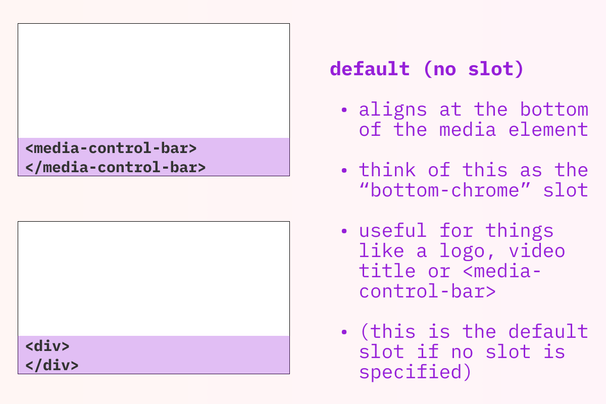
-
Render Location: Each child that doesn’t specify a slot will render at the bottom of the
<media-controller/>. If you have more than one element like this they will be stacked vertically. -
Common/Example use cases: showing one or more rows of controls at the bottom of the
<media-controller/>. For many use cases, you can simply add a<media-control-bar/>for each row of controls you’d like, which will provide you with additional automatic sizing and layout behavior.
top-chrome
Section titled top-chrome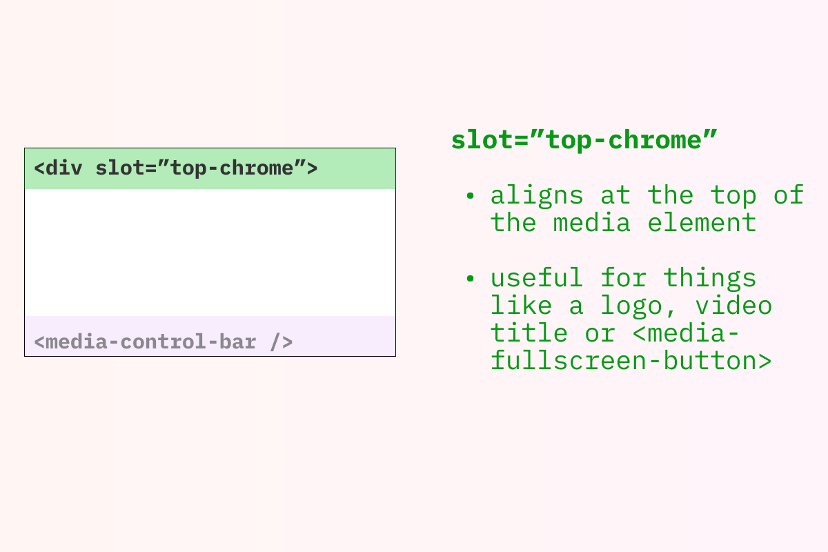
-
Render Location: Each child that specifies
slot="top-chrome"will render at the top of the<media-controller/>. If you have more than one element like this they will be stacked vertically. -
Common/Example use cases: showing one or more rows of controls at the top of the
<media-controller/>. For many use cases, you can simply add a<media-control-bar/>for each row of controls you’d like.- Demuxed 2021 theme (mobile screen sizes only) (view source)
middle-chrome
Section titled middle-chrome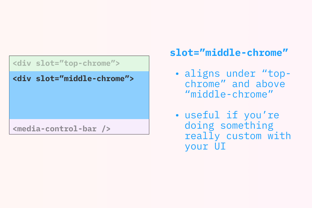
-
Render Location: Children that specify
slot="middle-chrome"will show up in the available space between any ”top-chrome” children and any default slot/”bottom-chrome” children. -
Common/Example use cases:
middle-chromewould generally be used for more specific cases, such as custom subtitle/caption rendering, or additional related content you’d like to show while the media is paused or has finished playback. While you can have multiple children that are “slotted to”middle-chrome, most likely, you’ll want to use one and style it to size/layout any custom content you’d like.- (Examples coming!)
centered-chrome
Section titled centered-chrome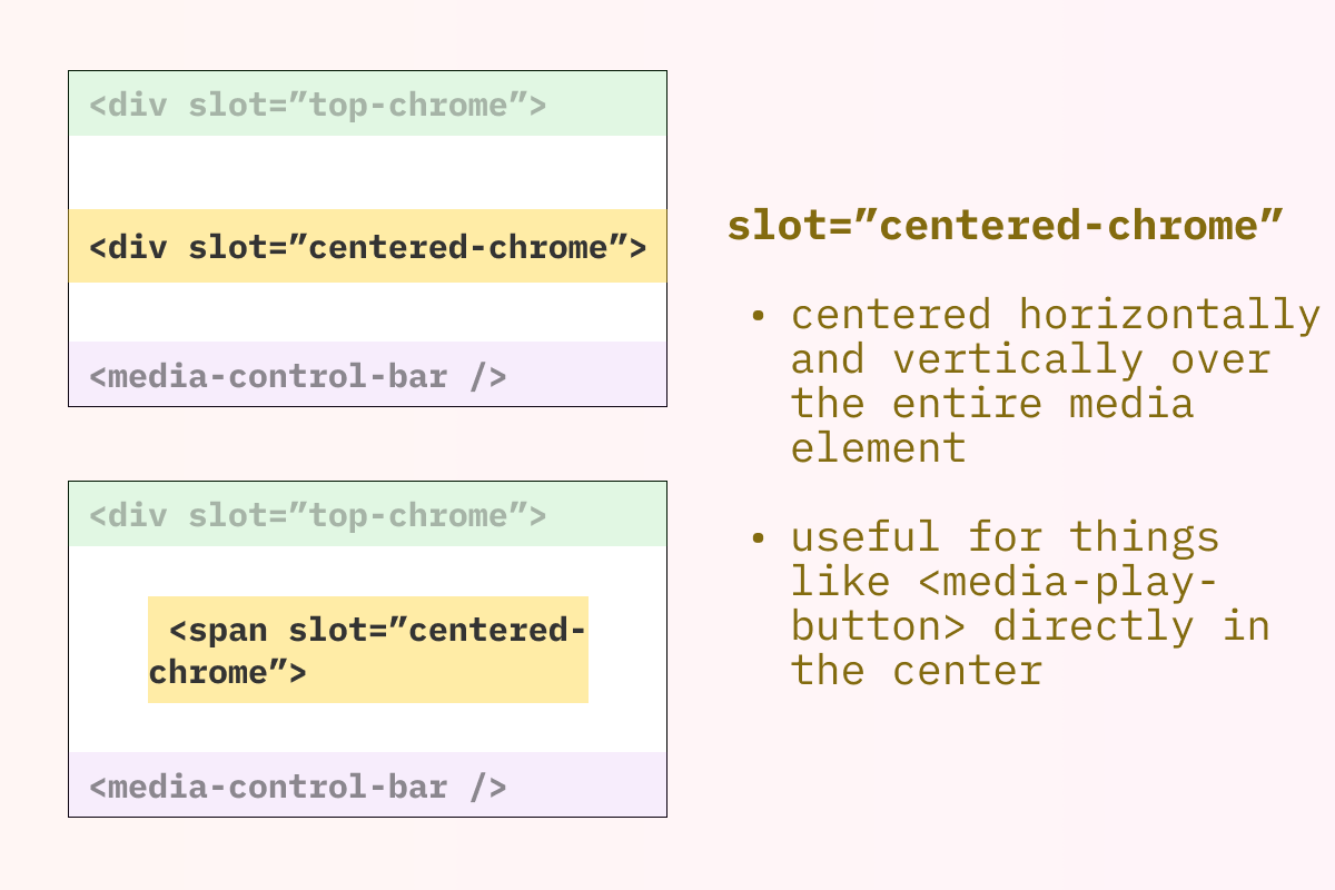
-
Render Location: The child that specifies
slot="centered-chrome"will show up in the center of the<media-controller/>and will be “above” anything in the default slot,top-chrome, ormiddle-chrome. -
Common/Example use cases: “big button” controls that are centered and horizontally layed out “on top of” the media. While you can have multiple children that are “slotted to”
centered-chrome, most likely, you’ll want to use only one, making styling and layout easier and more predictable.
Other use cases
Section titled Other use cases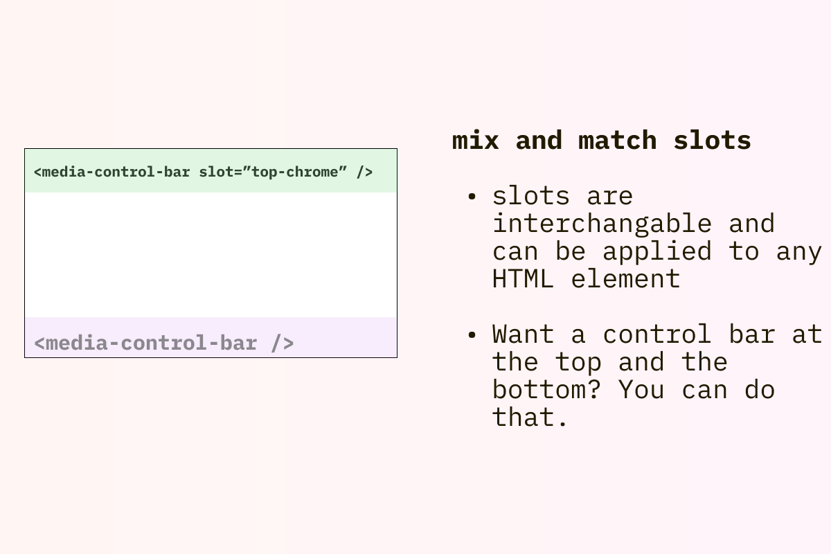
<media-control-bar/> at the top and bottom)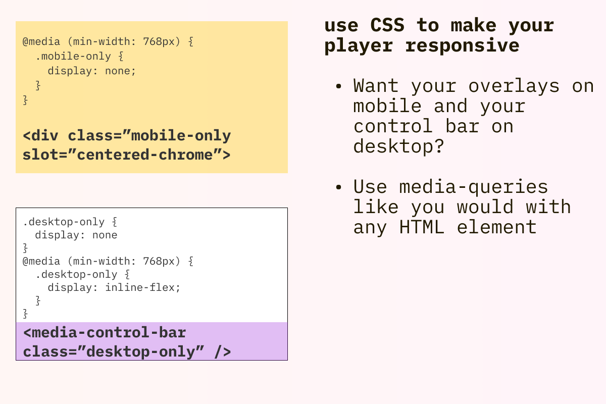
Working with slots (audio)
Section titled Working with slots (audio)Since audio chromes vary much more than video, it’s recommended that you only use the default slot and only add a single element (e.g. a single <media-control-bar/>) and style it however you’d like.
As we work through other common use cases, both internally and with the community, we may start adding additional “built-in” styling and layout for <media-control-bar/> slots used with audio.
- Example use cases: